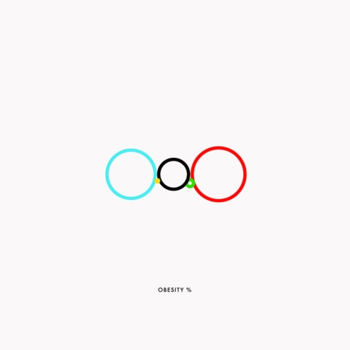
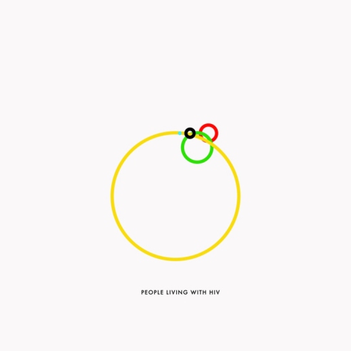
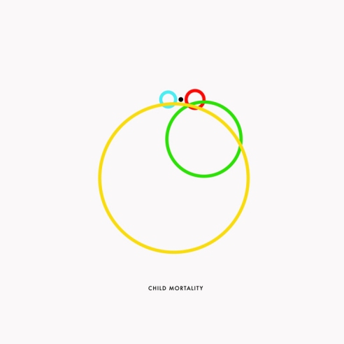
Globally relevant infographics via the Olympic Rings.
Gustavo Sousa “uses the five colorful rings, representing each of the five continents taking part in the games every four years, to display a series of informative graphs about the world we live in today. The topics range from general facts like the world’s population to staggering statistics that reveal the ratio of people living with HIV, as symbolized by the size of the circle representing their continental location. Key: Blue is Oceania (Australia and its proximate islands); Yellow is Africa; Black is Europe; Green is Asia; Red is the Americas.”
By Gustavo Sousa, text via My Modern Met.


