Where are all the awesome “Scientific Method” slides?
I said it before – the scientific method is awesome: but where are the cool visuals for it? You do a Google image search for the term “scientific method” and you’re awash with pretty basic and frankly uncool flowcharts. There’s even a weird acrostic involving slow rabbits, which is kind of funny, but hardly something that exudes awesomeness.
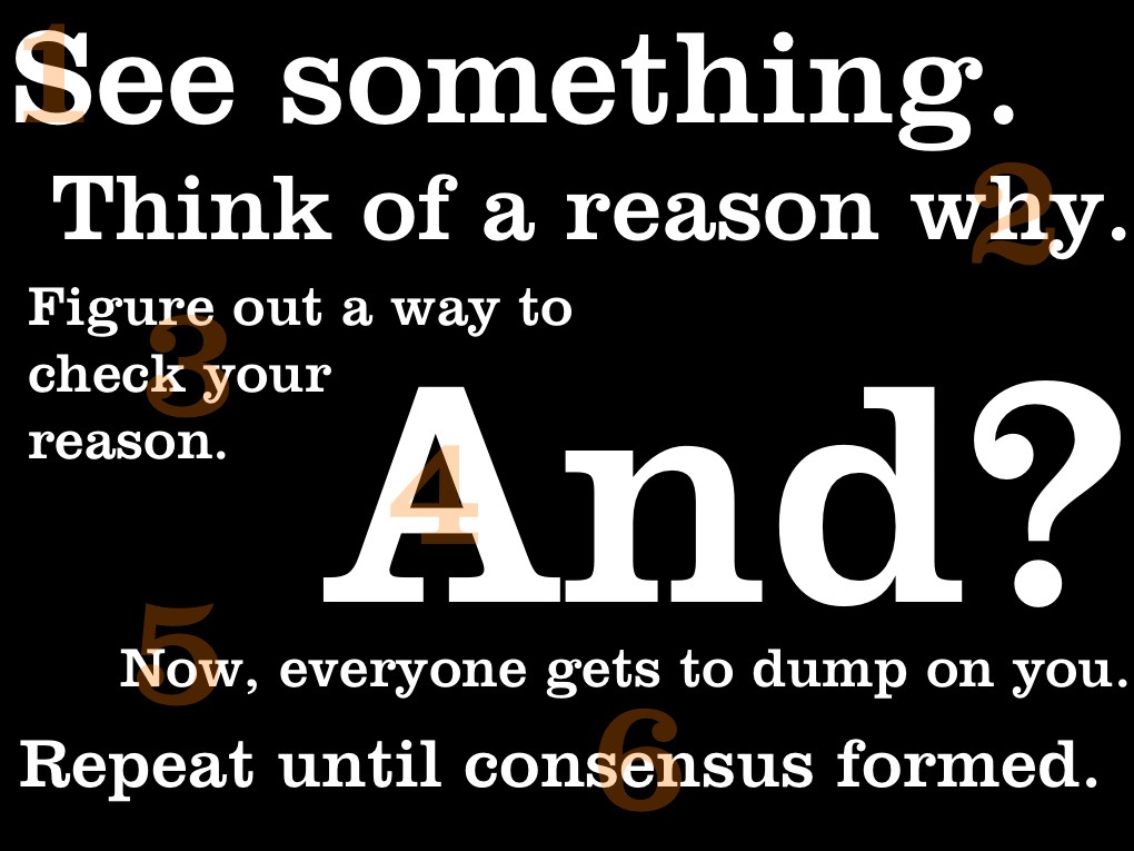
The one below is the one that I’ve made for my lectures, but unfortunately, my artistic talent is pretty much limited to “using a pretty font.”

(Large slide img link here)
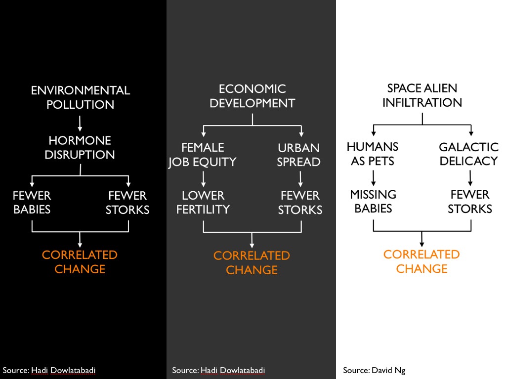
Here’s another I use for making hypotheses, with the scenario being a decline in birth rate and a decline in stork population occurring at the same time. Still, this is just using my other artistic talent which equates to “use the other pretty font you like.”

(Large slide img link here)
Would be wonderful though, if there are some out there that use cool illustrations or just nail it in the visual information department. If you know of any do pass them on in the comments.
(Originally posted at Boingboing.net)
– – –
